Thursday, 19 December 2013

Audience Feedback

Questionnaire - Audience Feedback

This questionnaire was designed to asked people about the genre of folk and also their understanding of folk.
 
1. What is your age?
* 11 -20
* 21 – 30
* 31+


2. What is your gender?
* Female
* Male

3. Do you know what folk is?
* Yes
* No

4. If yes, to the question above, then name a folk singer/band
……………………………………………………………………………………………………
……………………………………………………………………………………………………
......................………………………………………………………………………………

5. Do you think our video fits the typical folk genre you see, such as Passenger and Gabrielle Aplin?

* Yes
* No
* Other
 
6. If yes, to the question above, please explain why
……………………………………………………………………………………………………
……………………………………………………………………………………………………
……………………………………………………………………………………………………
……………………………………………………………………………………………………

7. Do you think there is a common theme throughout our digipak, promo and advert?
* Yes
* No
8. Do you think there could be any improvements on the digipak, promo and advert?
* Yes
* No

Please explain why
……………………………………………………………………………………………………
……………………………………………………………………………………………………
……………………………………………………………………………………………………
……………………………………………………………………………………………………
9. Out of ten what would you give each of our products?
Digipak - /10
Advert - /10
Promo - /10


10. Any other points?
……………………………………………………………………………………………………
……………………………………………………………………………………………………
……………………………………………………………………………………………………
……………………………………………………………………………………………………
…………………………………………………………………………………………………..
……………………………………………………………………………………………………
……………………………………………………………………………………………………
……………………………………………………………………………………………………
……………………………………………………………………………………………………
 
-----------------------------------------------------------------------------------------------------------
 
Results


We posted our official music video on Facebook and we have some responce so we screenshoted it and posted it.


Thursday, 5 December 2013

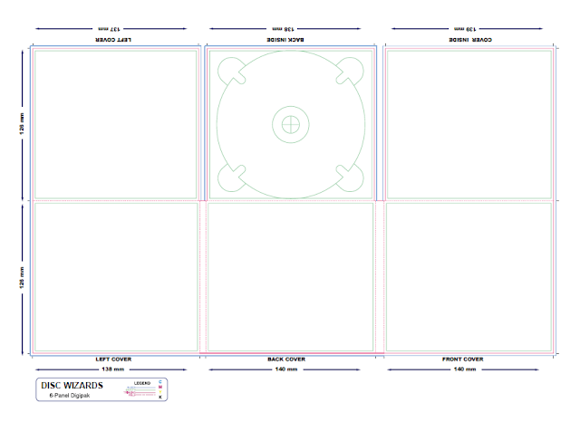
Ancillary Task - Our Digipak


Ancillary Task - Idea for our Digipak

Our ideas so far...

Since the band’s name is 'Sound of the Sirens' my group and I thought that it would be a good idea to link the theme of Sirens with the front cover for our digipak.


Ronnie draw this picture to create a primary source from an inspiration that we found on the Internet when performing our research on Sirens. By adding different colours and texture to the picture, it gives the audience an idea of good and bad sides to Sirens themselves. But keeping the 'Malevolent Sirens' in black and white give the impression that it isn't as friendly and kind like the one above. Ronnie chose the contrast to emphasize on the duplicity of sirens.


 These two pictures were taken when my group was in process with creating our music video. We thought that if we experimented and went well then we could use it later on however if we chosen not to use it then it only shows positive evidence towards our coursework.

We decided to spice it up a little by putting a simple and effective effect on it and this enriches the colours in the shot. By doing placing the black shade in the corners of the picture, it enhances the two main elements in the shot, the band members. We thought that it would be effective to do so because we wanted people to focus on the picture and link it to the music which has been produced.


The picture below is only a slight change from the one above since there isn't a black clouded effect around the edges.
 
 
This is an idea we had for the back cover for the digipak. This picture was taken when we filmed the narrative in Shillingthorpe Park. The lighting in the shot suggest a happy, bright and perhaps relieved atomosphere which is what we wanted to apply for the audience.


Tuesday, 3 December 2013

Ancillary Task - Magazine Adverts


Some of my ideas and inspirations: 9:30 am


I researched some Magazine Adverts on Google and this Poster came up for 'Mumford & Sons'. I thought we could relate to this since they are a folk, rock band from England. The design is simple but effective because it sets the scene using mise-en-scene. Each individual shots of the band members are very similar but different from each other.
For example, the four shots in the poster shots each member with their instruments that they play with when performing. Each shots is pictured in some sort of field with the sun light shining on them. However, I id notice that on the bottom right picture where Marcus Mumford is placed, the sun light is shining on him more so that the audience can perhaps see him more since he is the lead vocalist and perhaps people might say the most important member in the group. But since the four member are in four squares, exactly the same size, this show equality throughout the group because they see it as working together to create folk rock music for their fans not one individual and his three followers.
 
The name of the band 'MUMFRD & SONS' is bold as well as the name of the album. This shows that the titles are important but perhaps not as important than the band's image and music because the picture take over a lot more of the poster.
 
With the other credit, they are placed at the bottom with smaller writing which suggest the lack of importace to the band.