Thursday, 19 December 2013

Audience Feedback

Questionnaire - Audience Feedback

This questionnaire was designed to asked people about the genre of folk and also their understanding of folk.
 
1. What is your age?
* 11 -20
* 21 – 30
* 31+


2. What is your gender?
* Female
* Male

3. Do you know what folk is?
* Yes
* No

4. If yes, to the question above, then name a folk singer/band
……………………………………………………………………………………………………
……………………………………………………………………………………………………
......................………………………………………………………………………………

5. Do you think our video fits the typical folk genre you see, such as Passenger and Gabrielle Aplin?

* Yes
* No
* Other
 
6. If yes, to the question above, please explain why
……………………………………………………………………………………………………
……………………………………………………………………………………………………
……………………………………………………………………………………………………
……………………………………………………………………………………………………

7. Do you think there is a common theme throughout our digipak, promo and advert?
* Yes
* No
8. Do you think there could be any improvements on the digipak, promo and advert?
* Yes
* No

Please explain why
……………………………………………………………………………………………………
……………………………………………………………………………………………………
……………………………………………………………………………………………………
……………………………………………………………………………………………………
9. Out of ten what would you give each of our products?
Digipak - /10
Advert - /10
Promo - /10


10. Any other points?
……………………………………………………………………………………………………
……………………………………………………………………………………………………
……………………………………………………………………………………………………
……………………………………………………………………………………………………
…………………………………………………………………………………………………..
……………………………………………………………………………………………………
……………………………………………………………………………………………………
……………………………………………………………………………………………………
……………………………………………………………………………………………………
 
-----------------------------------------------------------------------------------------------------------
 
Results


We posted our official music video on Facebook and we have some responce so we screenshoted it and posted it.


Thursday, 5 December 2013

Ancillary Task - Our Digipak


Ancillary Task - Idea for our Digipak

Our ideas so far...

Since the band’s name is 'Sound of the Sirens' my group and I thought that it would be a good idea to link the theme of Sirens with the front cover for our digipak.


Ronnie draw this picture to create a primary source from an inspiration that we found on the Internet when performing our research on Sirens. By adding different colours and texture to the picture, it gives the audience an idea of good and bad sides to Sirens themselves. But keeping the 'Malevolent Sirens' in black and white give the impression that it isn't as friendly and kind like the one above. Ronnie chose the contrast to emphasize on the duplicity of sirens.


 These two pictures were taken when my group was in process with creating our music video. We thought that if we experimented and went well then we could use it later on however if we chosen not to use it then it only shows positive evidence towards our coursework.

We decided to spice it up a little by putting a simple and effective effect on it and this enriches the colours in the shot. By doing placing the black shade in the corners of the picture, it enhances the two main elements in the shot, the band members. We thought that it would be effective to do so because we wanted people to focus on the picture and link it to the music which has been produced.


The picture below is only a slight change from the one above since there isn't a black clouded effect around the edges.
 
 
This is an idea we had for the back cover for the digipak. This picture was taken when we filmed the narrative in Shillingthorpe Park. The lighting in the shot suggest a happy, bright and perhaps relieved atomosphere which is what we wanted to apply for the audience.


Tuesday, 3 December 2013

Ancillary Task - Magazine Adverts


Some of my ideas and inspirations: 9:30 am


I researched some Magazine Adverts on Google and this Poster came up for 'Mumford & Sons'. I thought we could relate to this since they are a folk, rock band from England. The design is simple but effective because it sets the scene using mise-en-scene. Each individual shots of the band members are very similar but different from each other.
For example, the four shots in the poster shots each member with their instruments that they play with when performing. Each shots is pictured in some sort of field with the sun light shining on them. However, I id notice that on the bottom right picture where Marcus Mumford is placed, the sun light is shining on him more so that the audience can perhaps see him more since he is the lead vocalist and perhaps people might say the most important member in the group. But since the four member are in four squares, exactly the same size, this show equality throughout the group because they see it as working together to create folk rock music for their fans not one individual and his three followers.
 
The name of the band 'MUMFRD & SONS' is bold as well as the name of the album. This shows that the titles are important but perhaps not as important than the band's image and music because the picture take over a lot more of the poster.
 
With the other credit, they are placed at the bottom with smaller writing which suggest the lack of importace to the band.


Thursday, 28 November 2013

Ancillary Task - Digipaks

A digipak is an original version of a normal music album package. This was used since the compact disc was first released in 1982. They typically consists of a gate fold paperboard with the surface binding with one or more plastic trays  so it can hold the actual CD/DVD.

Digipak were among the first alternatives to jewel cases to be used by major record companies.

Digipaks
  •  3/4 songs
  • 'Swish' CD cover
  • Cardboard
  • Lyrics, bands, blog - extra
  • Marketing tool/promotion
  • Limited edition/ bonus
  • Collections items
  • Relatively cheap to produce
Pictures - 4,6,8 sides

Conventions

·         Must have images that represent the theme of the album.

·         On most front covers of digipaks there must be traditional trademark sign of the artist or just a picture of the artist

·         There must be a continuous theme throughout the whole digipak in term of theme and the colour used as well.

Despite being made of paper, they were once considered an environmentally more friendly alternative to jewel boxes. However, they remain less common than jewel cases due to higher manufacturing costs.


Examples

Jewel Case


How it is made: A CD jewel case is made through a process called injection moulding.


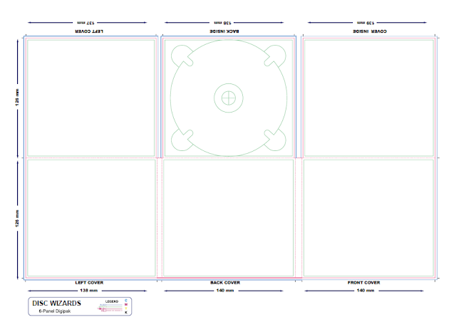
Above is the scale and measurement on a original Digipak. This example will help my group through making our own digipak for the band , Sound of the Sirens.

Analyse

 Rihanna - R&B


-------------------------------------------------------------------------------------------------------------
 
Ruby James - Folk


Ruby James is a blues vocalists and her Digipak of Desert Rose states her genre in many ways. For example, the colour's Digipak that she has uses have given us inspiration of our digipack for our ancillary task because on the front, it shows us the image of the artist in a country setting and my first thoughts were a country singer but then I looked rather into the CD and saw the clothes that she was wearing then on top of that did same research on the singer her background and genre of music then found out that her genre was Blues.

 
 Looking deeper into the digipak, the colours used, the close-up on the left side and the couples pictured on the right ...


with hre d be perhaps thought that this would

You can see that the pictures that are included have a couple, there is the singer with a guitar and they are set in the country. This is the type of example that we can take inspiration from when we design ours.
 
-------------------------------------------------------------------------------------------------------------
 
Gabrielle Aplin - Folk


GA's digipak


Above is Gabrielle Aplin's digipak for her album called 'Ghosts'.
The creation is simple and effective because all the picture relates to her genre of music, folk.
 
Its sticks to one theme throughout rather than having random pictures put together in a random order. The colour are subtle and gentle which could represent her personality as well as simple colours for the text and the background.
The black and white theme gives the impression of age or memories, it is simple and gives the album a sleek and defined look. The pictures that are used are of her but her face is always hidden, giving the album a feeling a mysterious also it is a intriguing tactic to get the audience interested.
Also, I think that her face is hidden because she wants her audience to just focus on her music rather than her looks which is what happens a lot in the music industry now-a-days.
 
-------------------------------------------------------------------------------------------------------------
 
Oasis - Rock
 
Definitely Maybe
Their first ever CD was released in 1994
 
 
Visuals

In this album cover, all band members are in one room but in different positions (standing, sitting and laying on the floor) this suggests the different moods and personalities throughout the member in the band.
Three of the band member are focusing on the television in the right which could show that they are less important than the Gallagher brothers. This is while Noel is sitting on the sofa, playing guitar. This gives the audience the impression that he is the main man in the group because the rest are relaxing while he is still showing his passion for music. Also Liam (laying on the floor) seems to be wearing John Lennon glasses. This could suggest how much The Beatles and of course John Lennon were such an inspiration to him and his music. Liam wanted to incorporate part of The Beatles in with his band.    

I spotted a few glasses of red wine in this picture, I feel that this is very interesting since the genre of music that they play is Rock, Alternative Rock and the band member are drinking red wine. This gives the indication of a different side, sophistication.

Another element in the shot that I noticed was the Globe in the top right hand corner of the CD album cover. In my opinion this has many meanings to it. Firstly, the world globe could symbolise that the world is on their side or even its in their hands and this suggest power and perhaps ignorance. However, another side to the meaning could be as simple as travelling. they have ambitions and dreams and want to accomplish them a long with their music.

On the fire place there is a picture of George Best playing for one of the Manchester team, City / United. Since the band are all from Manchester, it shows the loyalty to Manchester. Linking in with the Globe, they are showing that wherever they go, their loyalty will always be there. However, there could be an alternative analyse of the the picture near the fire lace. Perhaps since it is placed right next to the fire place, when the fire gets lit, the fire will start burning and so will the picture suggesting that they will not care about anyone apart from their selves, money and power because they are hopefully when the fire gets lit, so will their career. 

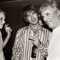
Finally, the portrait of Bert Bachararch, a pop composer also could suggest another inspiation for the Oasis band.


Research
Relationship -

Oasis' sound engineer Mark Coyle introduced them to Burt Bacharach's song 'The Guy's In Live With You'

Oasis' drummer, Tony McCarroll pointed out that the song's drum shuffle could be adapted for one of Oasis' acoustic numbers.

After a while Noel decided to adapt Baharach's song into his own version and Gallagher renames it 'Half The World Away'.

From these point, I would say that B. Bacharach is a huge inspiration to Oasis but especially to Noel Gallagher.


The conventional aspects of this CD cover is the band's name and title of the album as well as the full photo of the band member altogether.
However the terms 'definitely maybe' look in a hand written font which could suggest the creative side to the band as they write their own original song not copies.

The colour in the cover suggest a relex atmosphere and with all th props its could suggest wealth and power as well.

Wednesday, 27 November 2013

The Pierces

More inspiration  


During last week we have had some different people looking at our music video as we had asked them to rate it and give my group constructive criticism and one person that advised us to research the band 'The Pierces' was a English teacher because he thinks that we could get some inspiration from these two since their duo and our band who we are making a music video for, Sound of the Sirens.

I have researched some of their music video and I like some of their ideas in the video, Glorious especially the retro effect that they have throughout the performance/video.


Screenshots of Glorious...


This shot is placed right at the begining of the video and it shows the two band members growing through their audience to prepare perform to them.
They girls are in the middle of the shot because this suggest they are the impotant people in the shot in that time and all the attention and focus is on them.


With this shot, again, the most imporant prop is the old fashion camera and this reprents the time period that are were in when shooting the video.

Also, on the right at the back, there is a lady wearing a pale, salmon colour dress which also could support that point about the time period.


Slightly further into the video when the singing begins, Allison (brown hair) is positioned in the centre of the shot while Cathrine is more left to show that she isn't as important at this point in time since Allison is about to introduce he first line of the song and they want to audience to concentrate on the person singing the song rather than other elements to the video.

This close-up shot behind Cathrine suggest a positive atmosphere especially with the blue/green tones in the lighting because it contradicts the emotions the audience would associate it with.
Its bright and very bold colour to also represent party and having a good time while enjoying the performances.   


This mid-shot show the retro style as well as the time period.
The red colur effect suggest danger but then again love and effectiveness.
On the sides of the shot again shows a retro effect in the mid 1900s.


The final shot of the video shows the two sisters/band members in their finishing positon as well as the drum stick near the centre.
The main focus would be Cathrine's dress, hair and body langage.
It is a sesure and steady end pose.


 Information on The Pierces

The Pierces are mainly based in NYC and consist of two sisters, Allison and Catherine Pierce hence their name, The Pierces.

They origin from Birmingham, Alabama in the USA.

Genre of music: Psychedelic rock, psychedelic pop, psychedelic folk, folk rock, folk pop, pop and rock.

Years active 2000 - Present

Website - http://www.thepiercesmusic.com/

Monday, 18 November 2013

An Idea for Starting Promo


These shot are some examples of how we were going to begin our music video. However, in the end, we decide that it didn't look right for the genre of the music.

I am glad we tried it out and then found out it didn't work rather than not demostrating our ideas and thinking what would happen if we didn't do it and how could it of changes the promo.